
Thursday, 31 December 2009


Tuesday, 29 December 2009
MUSIC MAGAZINE Double Page Spread
Pictures Chosen

I wanted black and white photos as i think even though using colour is bright, the black and white looks more eye catching and nicer to look at. It is also unique and makes the photographs look more classy. It also goes nicely with my theme.
I chose the large pictures on the right hand page to be transparent so i can still write on top of them. I chose the really quirky photos as the others are very posed.
The title font is the same as my contents page font and my front cover font to keep continuallity.
The red lines around the page are to keep the red theme and lines the page nicely with a bold colour contrasting with the black and white.
Friday, 25 December 2009
MUSIC MAGAZINE Contents page research
Contents Pages I Like
 I really like the house style for both these Q contents pages. The layout looks really clear and simple-yet interesting to look at. I like the chosen colours and fonts and think its an easy contents page to look at and read. I would like to follow these styles.

 I really like the house style for both these Q contents pages. The layout looks really clear and simple-yet interesting to look at. I like the chosen colours and fonts and think its an easy contents page to look at and read. I would like to follow these styles.
Thursday, 24 December 2009
MUSIC MAGAZINE Front cover Title
Chosen Font for Title


I chose this font for my title as I think it looks simple and clear to read. It's written in a certain style which looks interesting and eye catching. I wanted to the title to be behind the model so the model is the main focus but the title is still easily able to read.
Testing with Title Colours
(Original picture chosen for cover-used as example for colours)


Wednesday, 23 December 2009
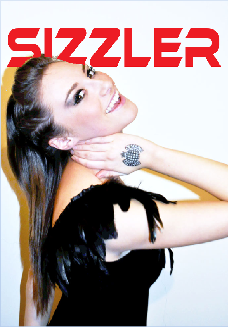
MUSIC MAGAZINE Picture chosen for cover

Stamp:
I've chosen this picture as I want to have an attractive, classy, young female on the cover looking 'glammed up' and celebrity looking. She has a 'ministry of sound' stamp on her hand. This is because I had an idea that she is famous for being a dancer/singer for the 'minestry of sound.' I then thought it would be interesting to show the ''glam'' side of her-showing that she has had a make over to look classy and show 'the other side of her'.
Positioning:
I have chosen her to do this position as I think it looks striking and shows the stamp as the main attention in the middle of the cover. I wanted her to be looking into the camera as it is very eye catching as she looks straight at the reader. She's positioned slightly to the left so the stamp is in the middle. I also didn't want her centre as it looks a bit boring and common.
Clothing:
She is wearing a black dress with feathers on so it doesn't look to bold with colour but looks classy and subtle.
Hair and Make Up:
I've done her hair and make up specifically so she looks striking and neat. I made sure her hair was out of her face-tightly plaiting the sides and creating a quiff at the top. I then straightened the rest to look smooth and sleak. Her make up is big and striking using dark colours to bring out her eyes and make her look fierce.
Monday, 21 December 2009
MUSIC MAGAZINE Decision For Title
I want my magazine to be mainly about music but also have a classy sex appeal to it also involving fashion and glamour.
I want the title to sound sexy but not tacky like a "lads mag".
Some of the suggestions I came up with were:
-SAUCY
-ANIMAL
-SPICE
-SXE
-BEATS
-SIZZLE
-SIZZLER
Overall I like the sound of 'SIZZLER'. This is because it sounds sexy yet when it is said outloud it sounds quite like the symbols on a drum kit-representing a music magazine.
FONT
Font suggestions:


Sunday, 20 December 2009
MUSIC MAGAZINE Production
- My target audience ranges from consumers interested in music and gossip from the ages of 16-30's, my magazine would be aimed at two audiences for different reasons. The primary audience would be females for the music interest and gossip/glamour and the secondary audience is aimed at males for the sexual interest and music information.
- I will represent this by using images of young adults interested in music-mainly female.
- The class my magazine is aimed at is B, C1 and C2.
MUSIC MAGAZINE Reasons for Choosing Magazine & Blender magazine Research
My chosen area for my final coursework piece is going to be Magazine (Print).
I have chosen this as I feel most confident with this topic, and that I could produce a better piece in the printing area than moving image and show my creative skills when producing a magazine.
I want my magazine to be a mixture between music and fashion/glamour.
To help me with this process I am going to research certain music magazines:
'BLENDER'
Blender was an American music magazine that billed itself as "the ultimate guide to music and more". It was also known for sometimes steamy pictorials of celebrities.


These are just a few examples of covers of the music magazine 'BLENDER'. I am going to list the particular aspects I like on these covers.
- The title font is the same in every magazine, yet the colours change to match the theme of eveything else on the cover.
- Almost every celebrity featuring on the cover of 'BLENDER' is a young female-attractive, wearing not very many clothes.
- The positioning/pose of each girl is always creative-made to look like a dance pose.
- I like that there are no other photographs placed around the cover trying to advertise more stories to attract the audience. I personally see this as being slightly tacky and looking naff.
- These covers are classy but at the same time give a sex appeal which I think would attract larger audiences.
'BLENDER' compiles lists of albums, artists and songs, including both ''best of'' lists and ''worst of'' lists. In each issue, there was a review of an artist's entire discography, with each album being analyzed in turn.
Saturday, 19 December 2009
MUSIC MAGAZINE Research


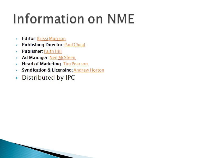
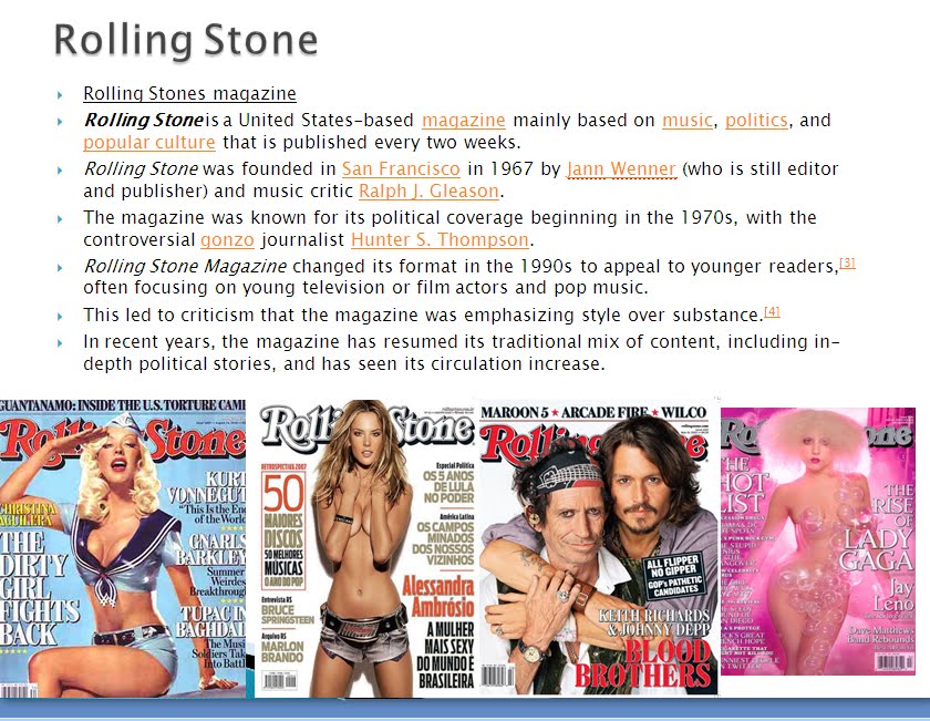

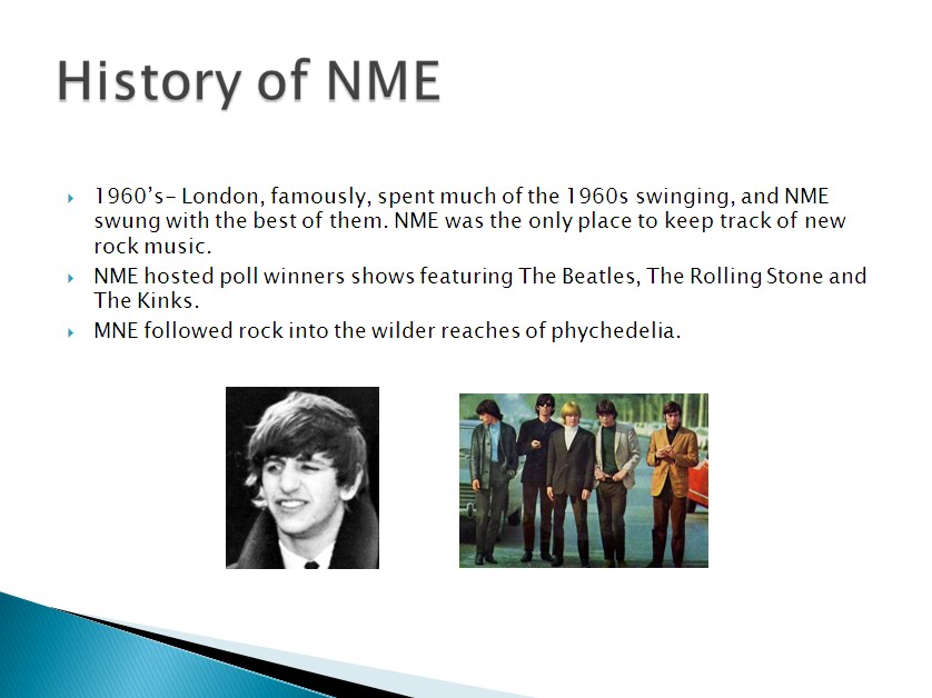
This power point explains why I chose to make a music magazine. It also shows the research I did on music magazines and the different eras, and why this is important to do before I make my magazine.
Below the power point is my front cover flat plan example. I researched some front covers from NME and used similar ideas but changing it with my own style.
Subscribe to:
Comments (Atom)