Saturday, 16 April 2011

Possible Titles and Fonts for magazine front cover
I like the title 'Channel' as it links to tv and movie channels and indicates this is the channel to be tuned to with all the best films and programmes to be watching.
 This font is also a microsoft font called 'impact'. I like that it is very thick and bold but think it looks a little too boring. A difference in the sizing of letters could make it look a little more interesting.

This font is also from 'dafont.com' and is called 'Harabara'. I like it as its bold and stands out yet doesn't attract the attention away from whats on the cover.

This font is a simple font from microsoft called 'Swis BT'. It is much plainer than the first font but still stands out. I like it in the colour red as this is a colour that represents horror.

Movie Magazine Cover Planning
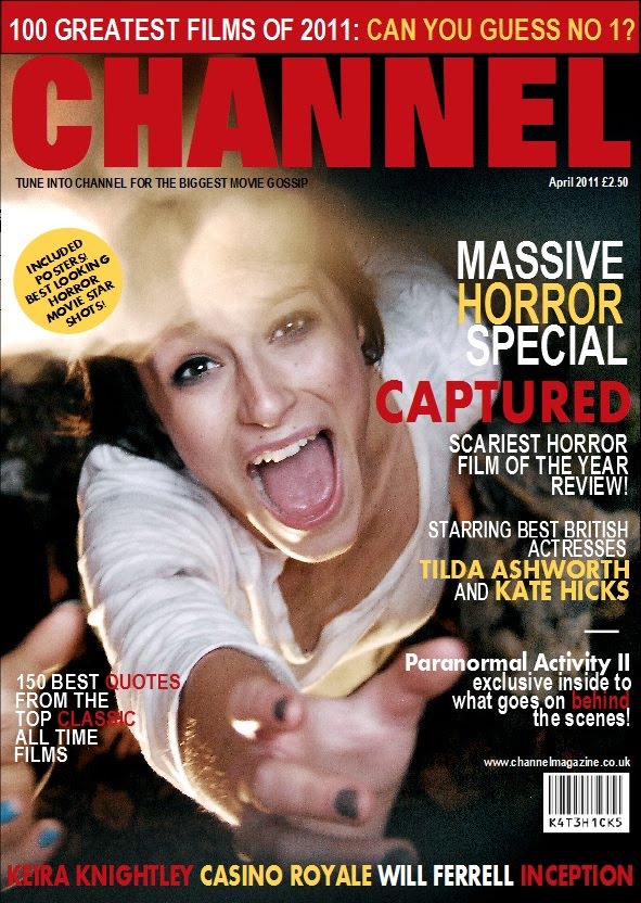
 This is the picture I want to use for the front cover of my magazine. I really like it as the girl is looking directly into the camera and reaching her hand out screaming. This would be very eye catching on a magazine shelf and draws the reader in. The genre is also very clear it is horror so represents the film very well. The girl in the picture is centre which leaves lots of room for writing and the masthead at the top.
 Wednesday, 30 March 2011
Possible Tag lines
- The fight to stay alive has begun There is no escape.
- Say goodbye to the outside world.
- Hell lies behind closed doors.
- The only way to survive is to play along.
- Behind closed doors...hell awaits.
- Sometimes its too late to escape.
- An ordinary day turns into an unavoidable nightmare.
- How far would you go to escape.
- What would you sacrifice to save yourself/get out.


Tuesday, 22 March 2011
Font and Title possibilites

The title of our horror film is going to be 'Captured'.
We decided this title goes really well with our plot and according to my poll, so does the public. We wanted to have a certain font that looked scary and creepy but not looking comical or a holloween style. I thought this font suited the title really well as it isn't too obvious, yet still looks mysterious and haunting.
These are diferent ways of how to write it. Alternating the capital letters with lower case letters gives different sizes and a defferent effect to the word. My favourite is the last word as the beginning, middle and last letters all stand out bringing the word out more than the others.
 This is a font called 'REQUIEM' from da.font.com website.
 Production and Institution
 Fox Searchlight Fox Searchlight Pictures, established in 1994, is a film division of Fox Filmed Entertainment alongside the larger Fox studio 20th Century Fox. It specializes in independent and British films, alongside dramedy and horror as well as non-English-language films, and is variously involved with the production and/or distribution of these films. Fox Searchlight's have produced films such as Slumdog Millionaire, The Full Monty, Sideways, Little Miss Sunshine, Juno, Black Swan and 127 Hours.
  Optimum Releasing Optimum Releasing is a film distributor company working in the UK. The company releases many films, especially foreign language films, but is perhaps best known for its anime releases. Optimum's image is that of a modern, independent new release and back catalogue distributor, and they release films under four strands. Both these production companies are independant and have produced films similar to our genre, they are both British and very appropriate for our trailer.
Subscribe to:
Posts (Atom)